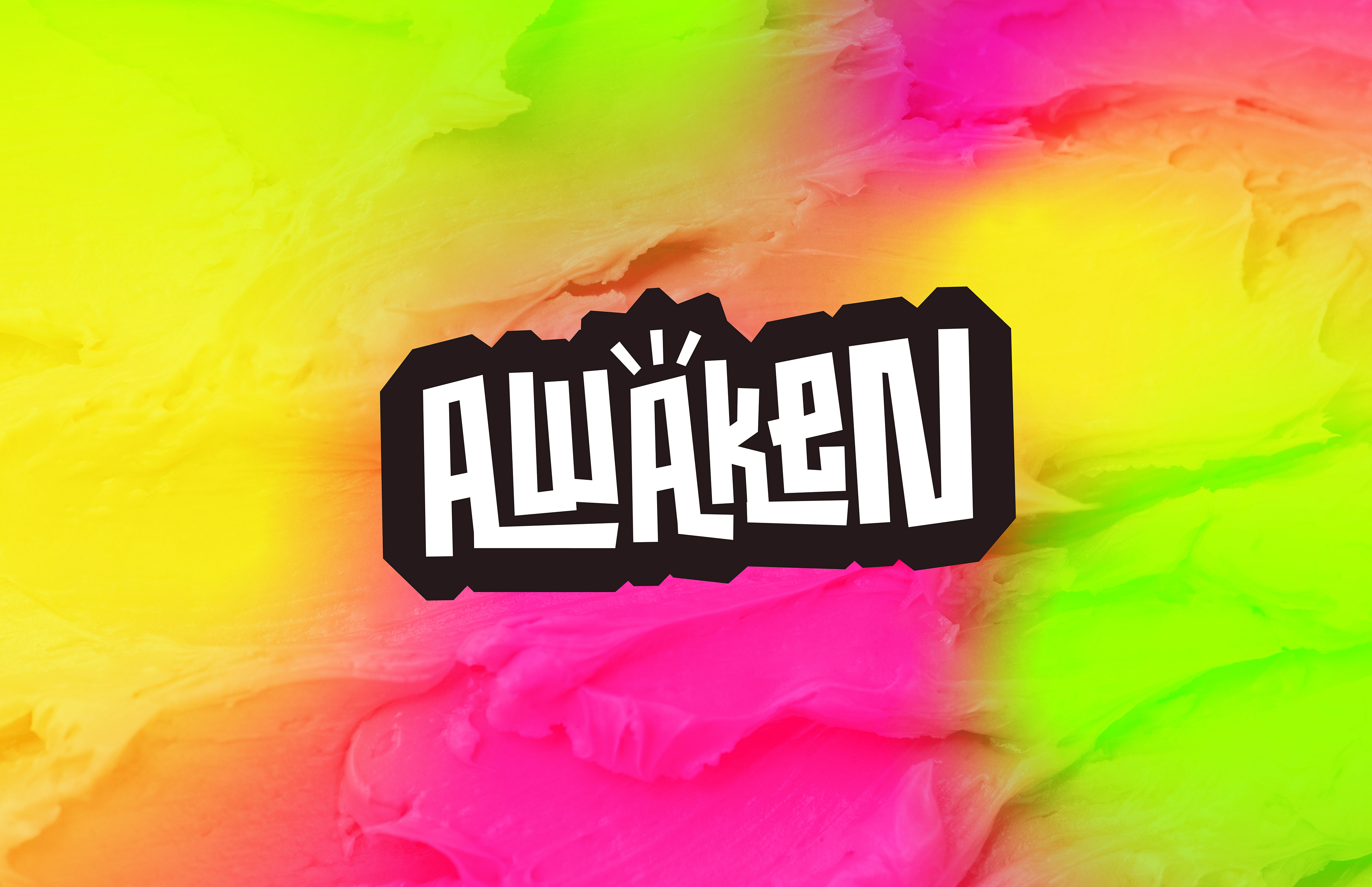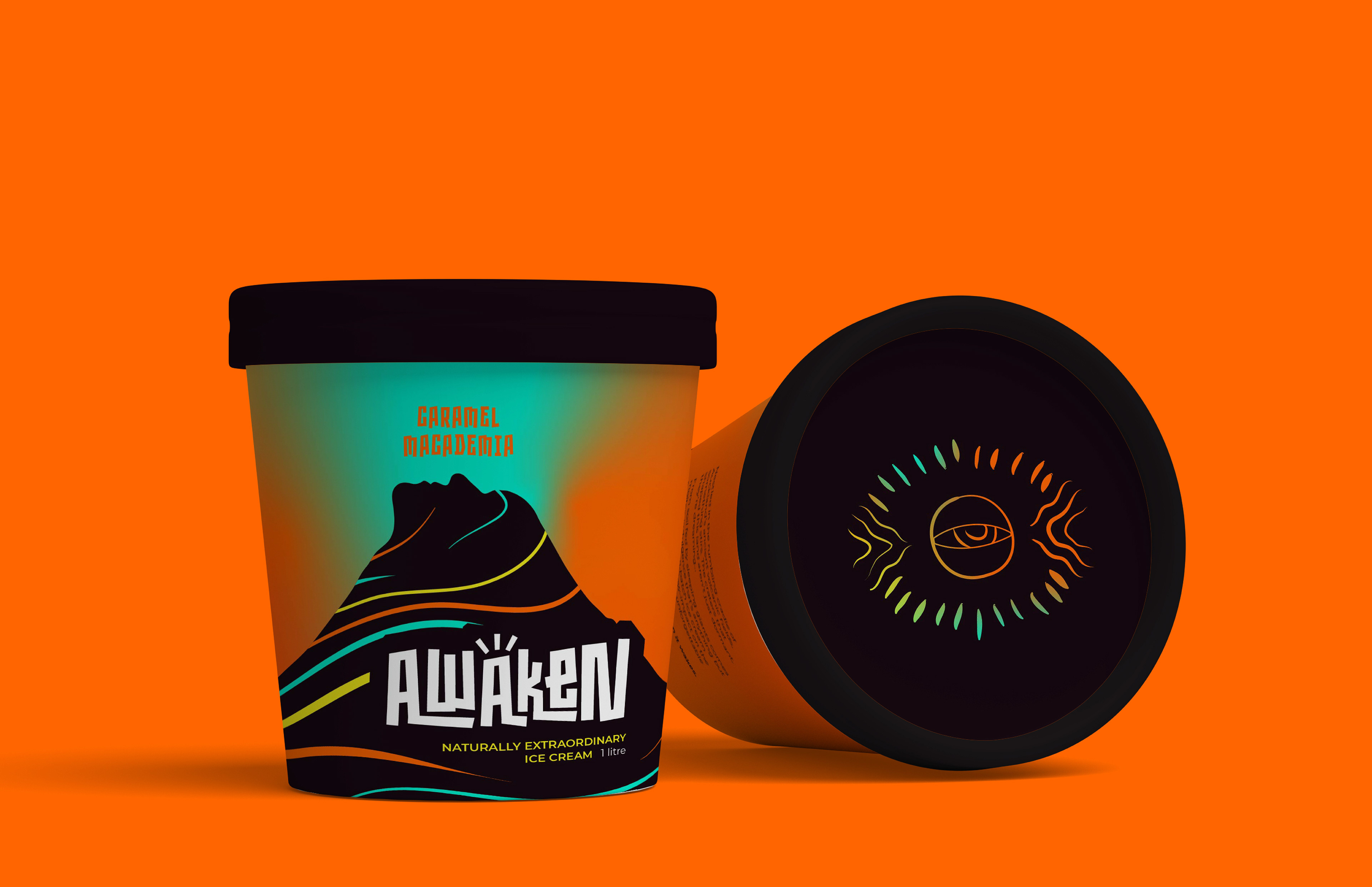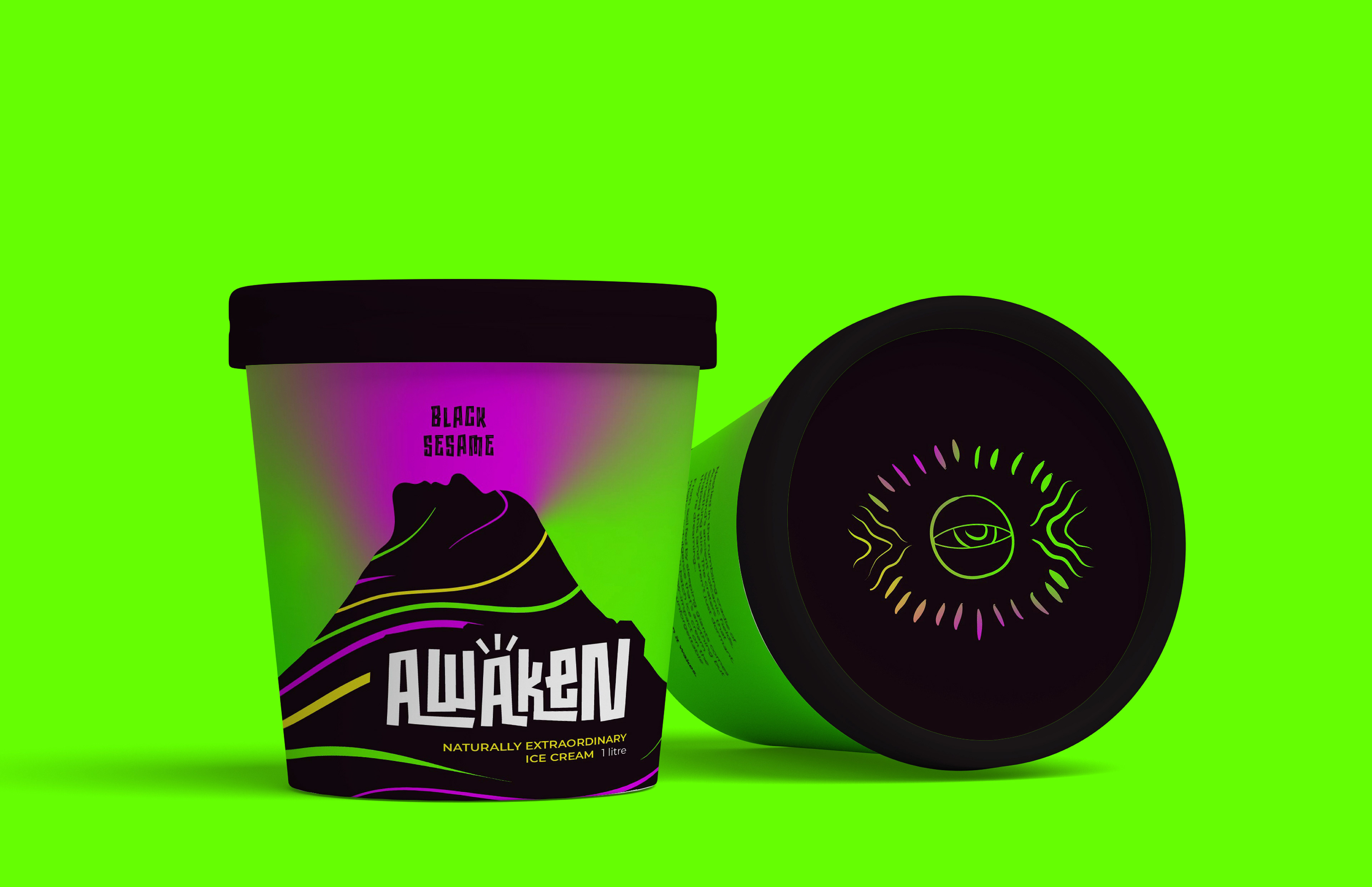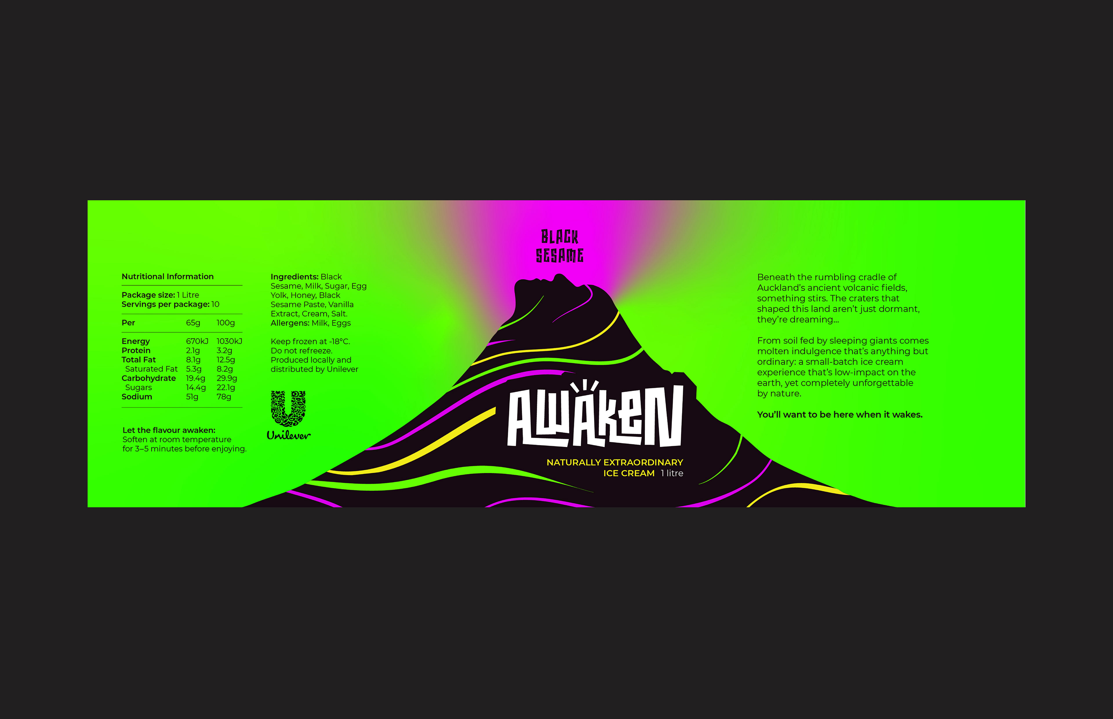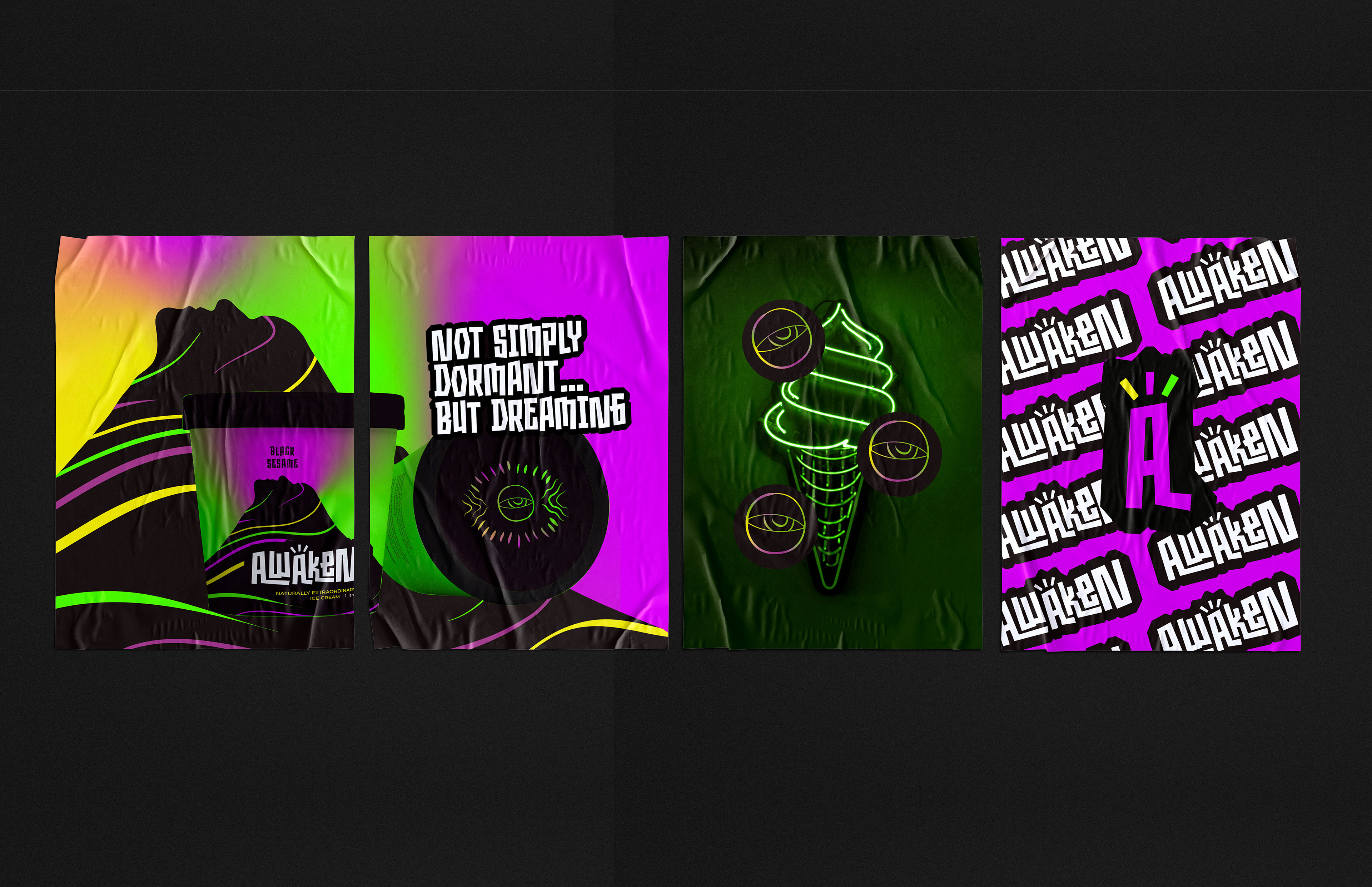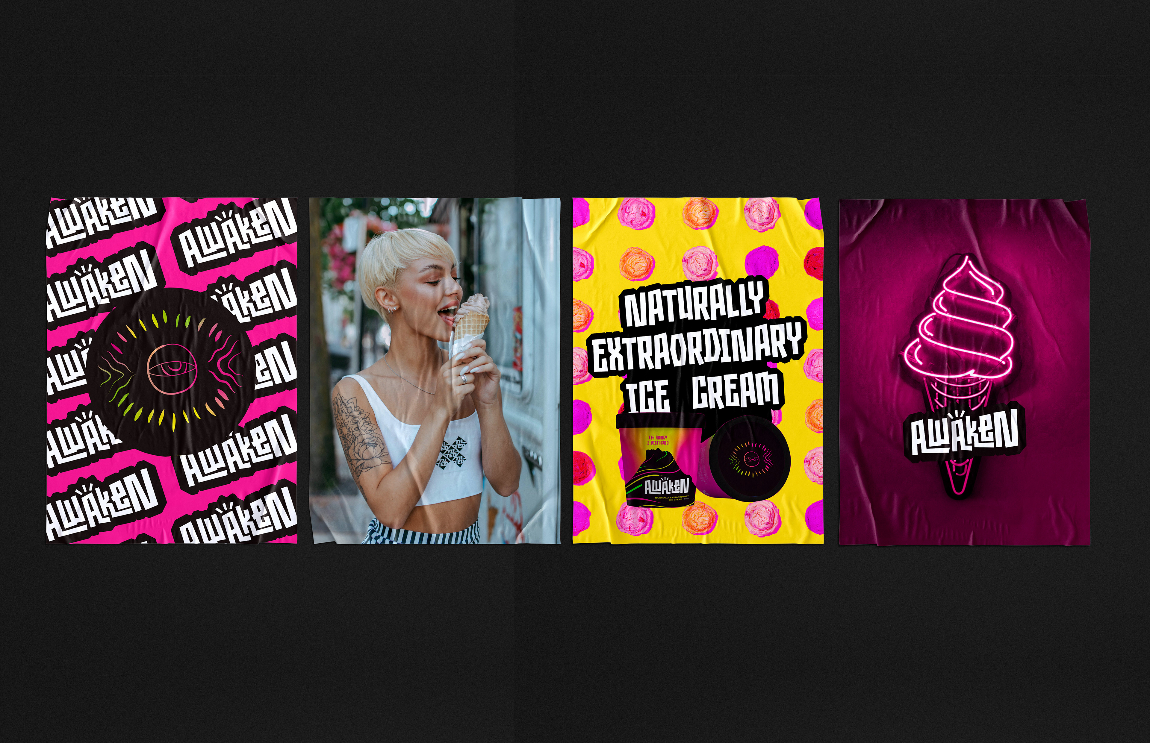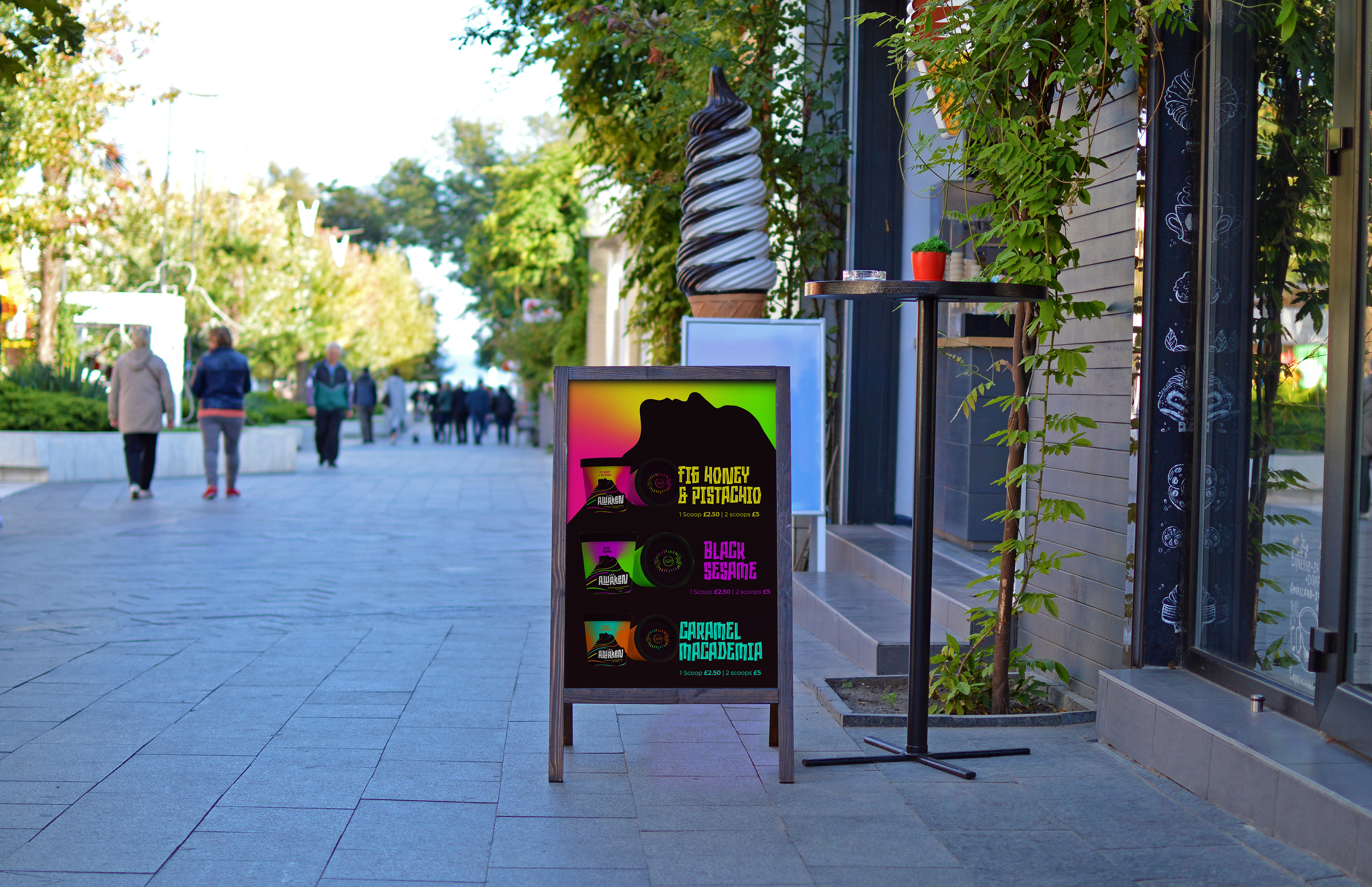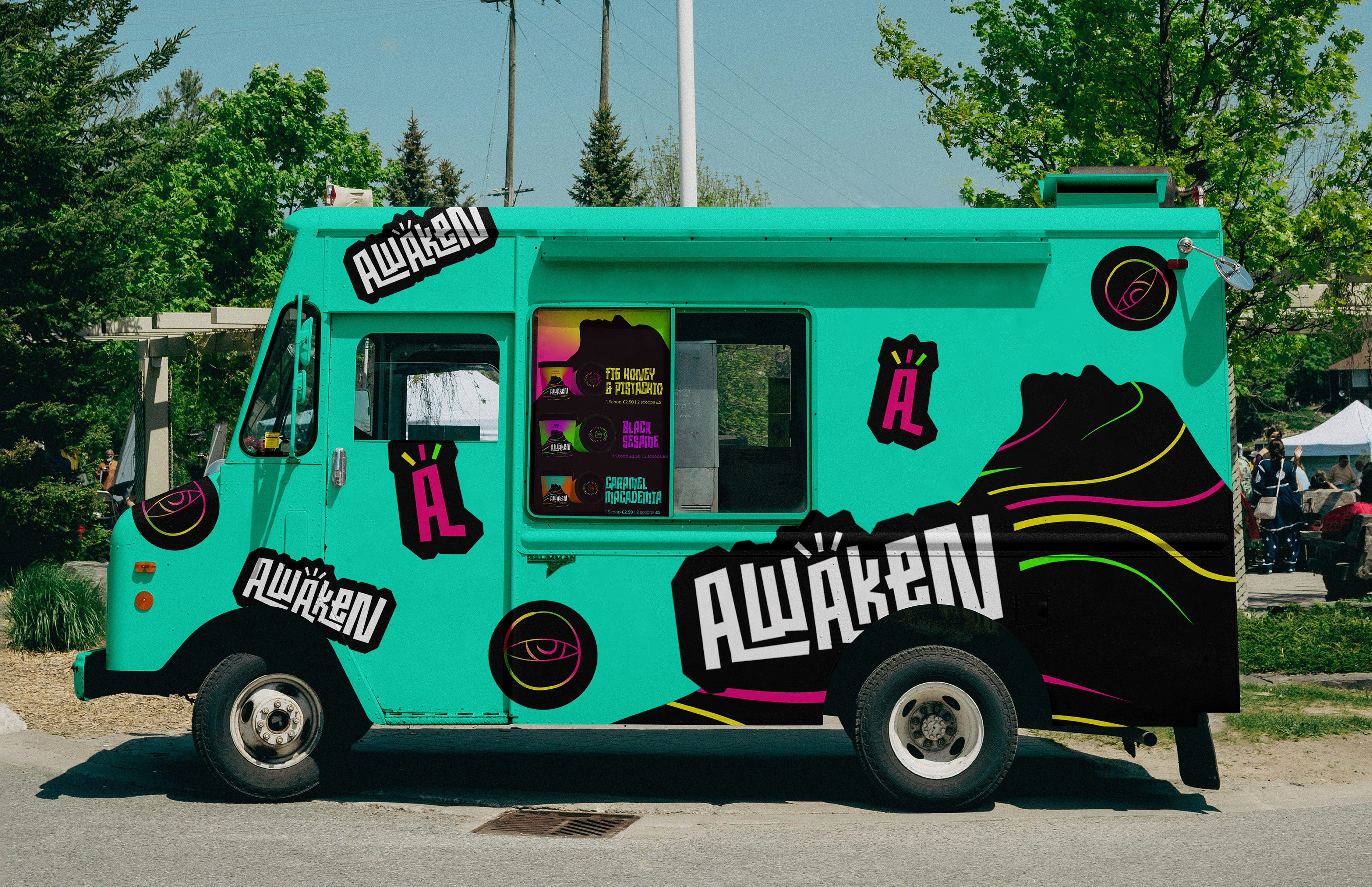
Awaken
Using only organic, sustainably sourced ingredients from the founder’s family farm in Auckland, Awaken is a new small-batch ice cream venture built around unconventional flavour experiences rooted in a deep connection to the land. Alongside the full packaging system, this project also involved developing the brand from the ground up, including naming, tone of voice and a wider product story.
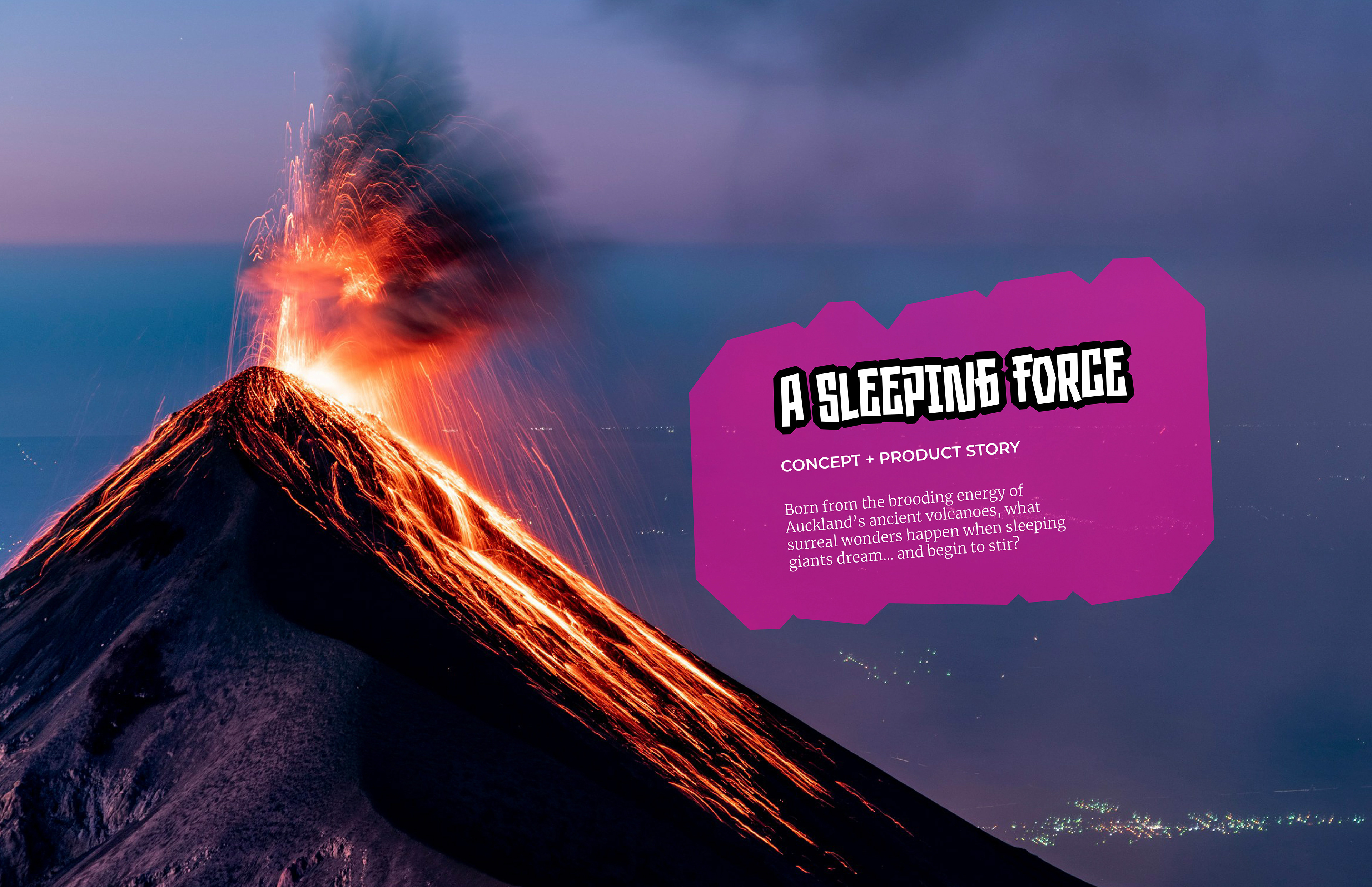
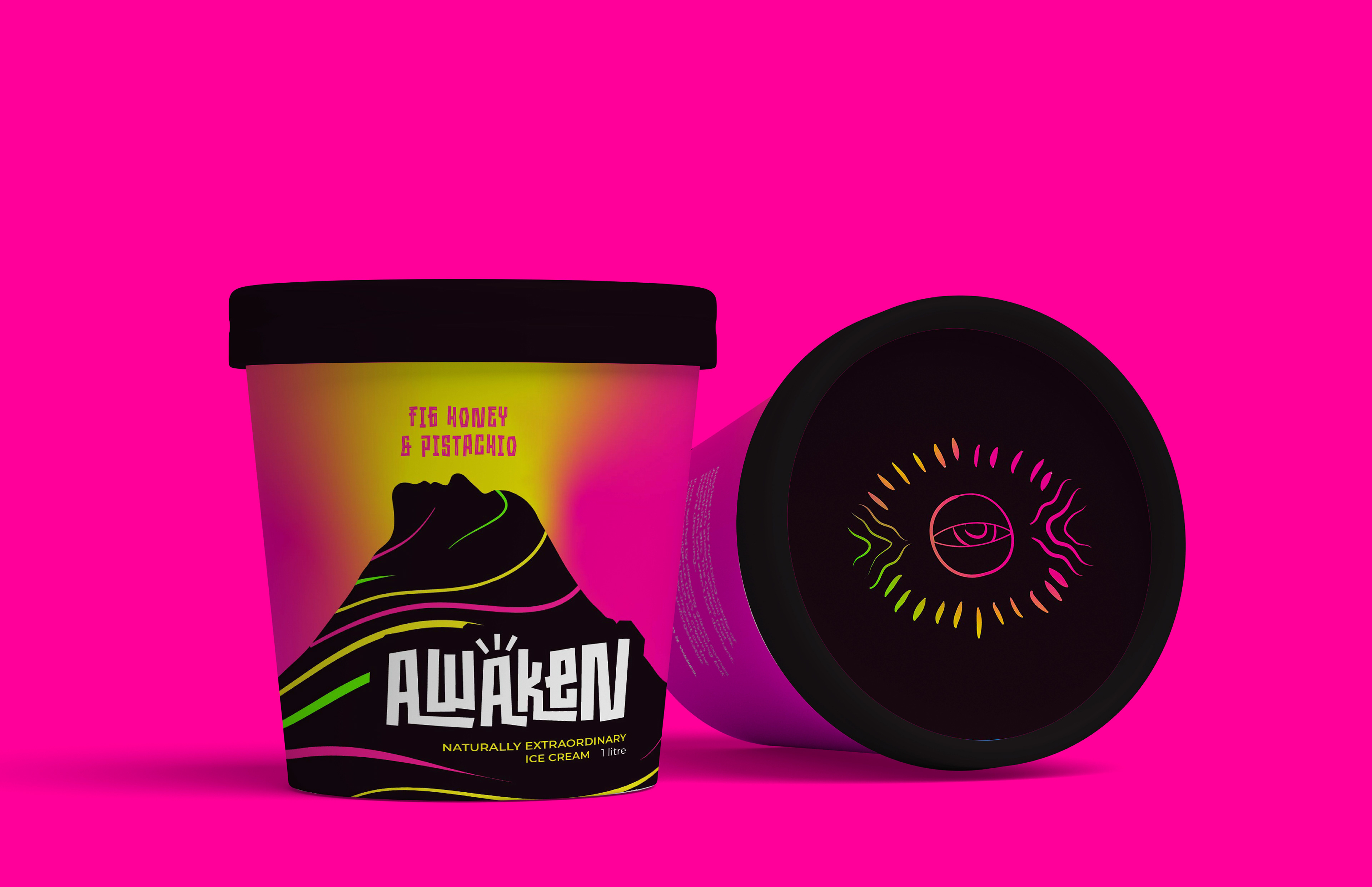
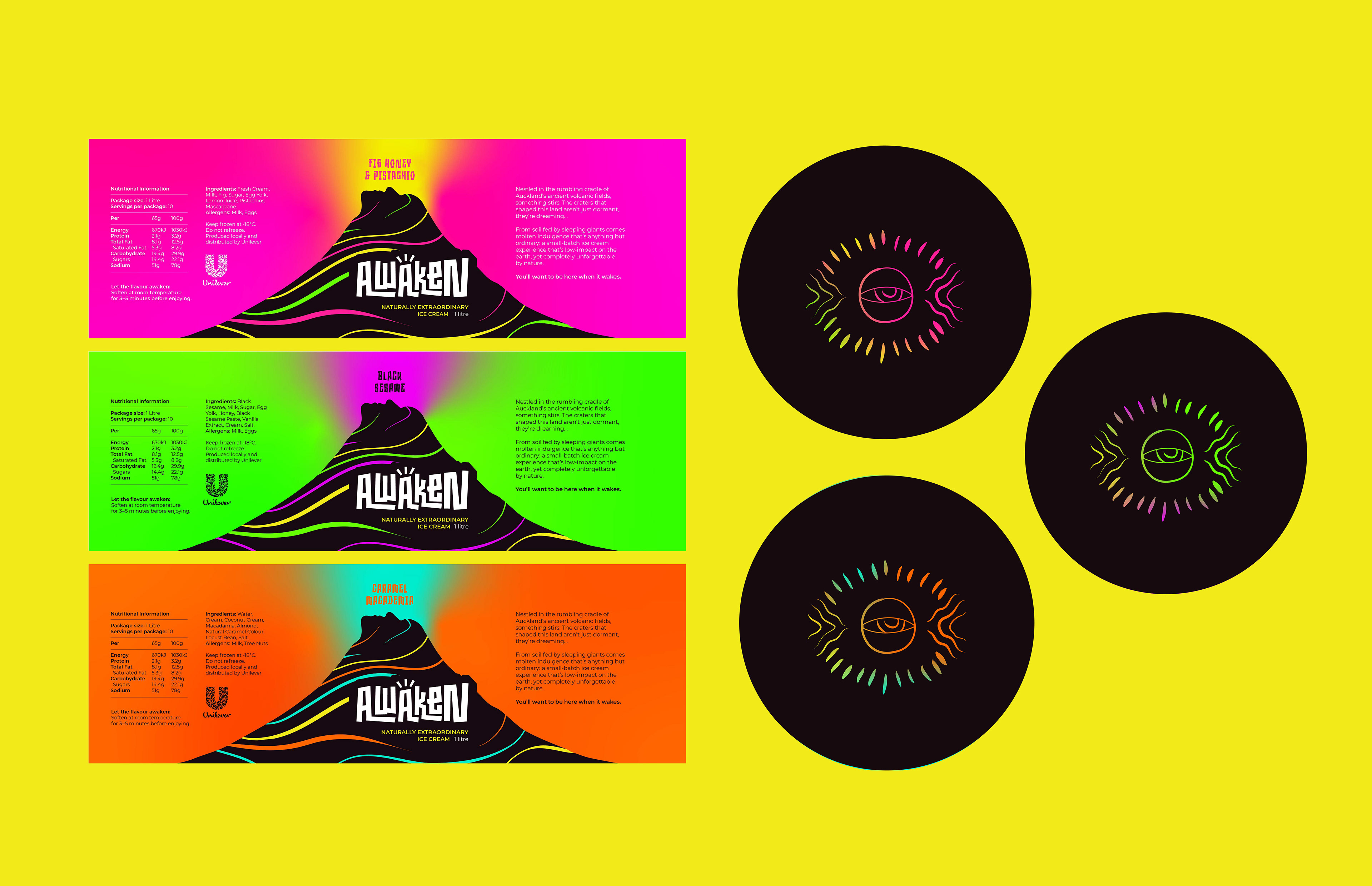
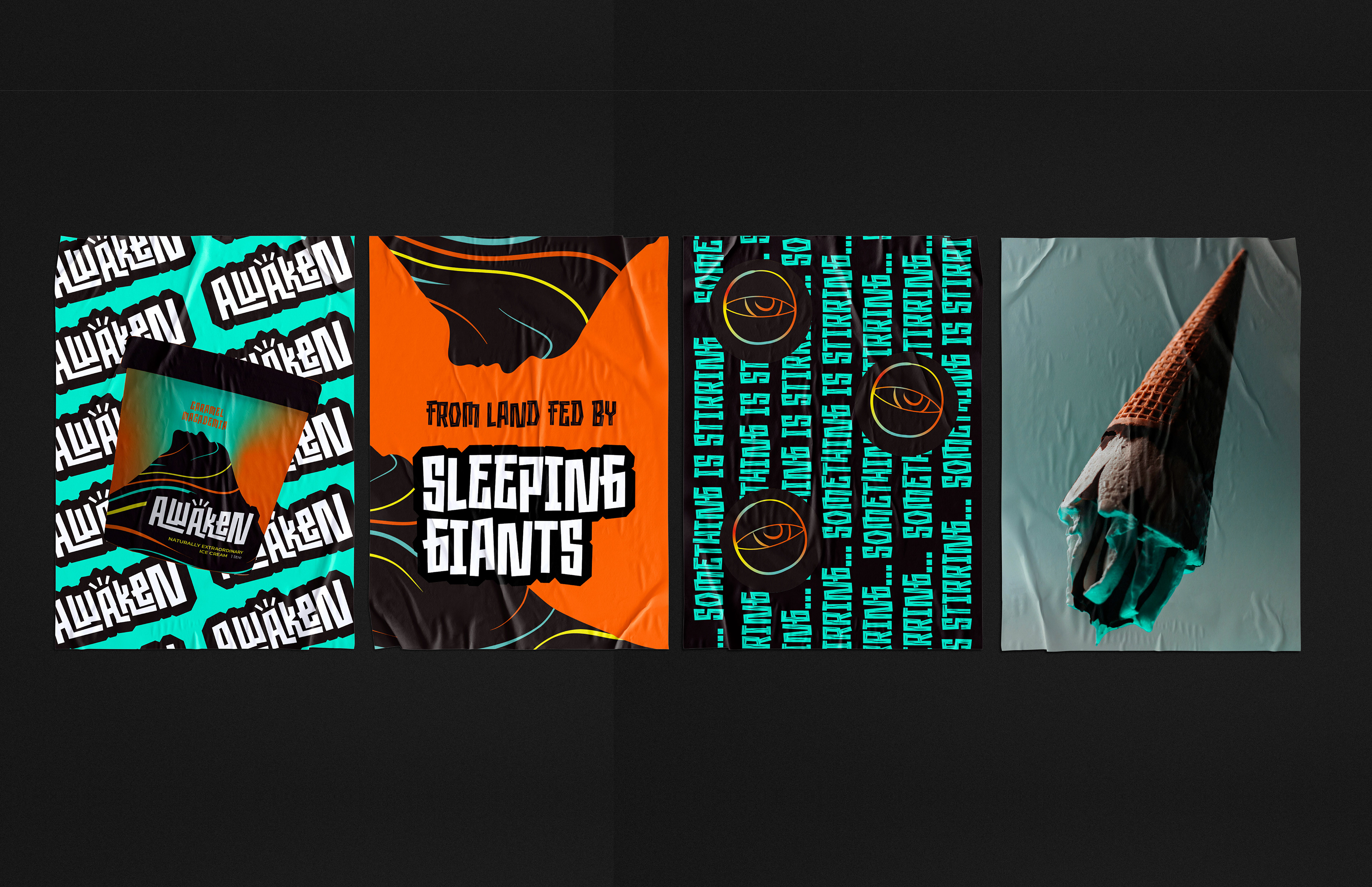
Drawing inspiration from Auckland’s unique volcanic landscape, the product’s narrative world emerged from the relationship between dormant geological energy and the fertile land responsible for the product’s exceptional ingredients. The visual identity intentionally moved away from more familiar category conventions in favour of something far more mysterious, surreal and visually disruptive, reflecting both the dream-like intensity of the flavours themselves and the dramatic environment from which they originate.
Combining striking neon gradients, dark volcanic imagery and playful narrative-led copywriting, the final packaging creates distinctive shelf presence designed to attract independent stockists whilst appealing to consumers seeking novelty and discovery. Central to the brand system is the understanding that conscious consumer choices can be just as instinctive as any other when driven by bold, distinctive design.
Packaging | Brand Identity | Illustration | Copywriting | Concept Development