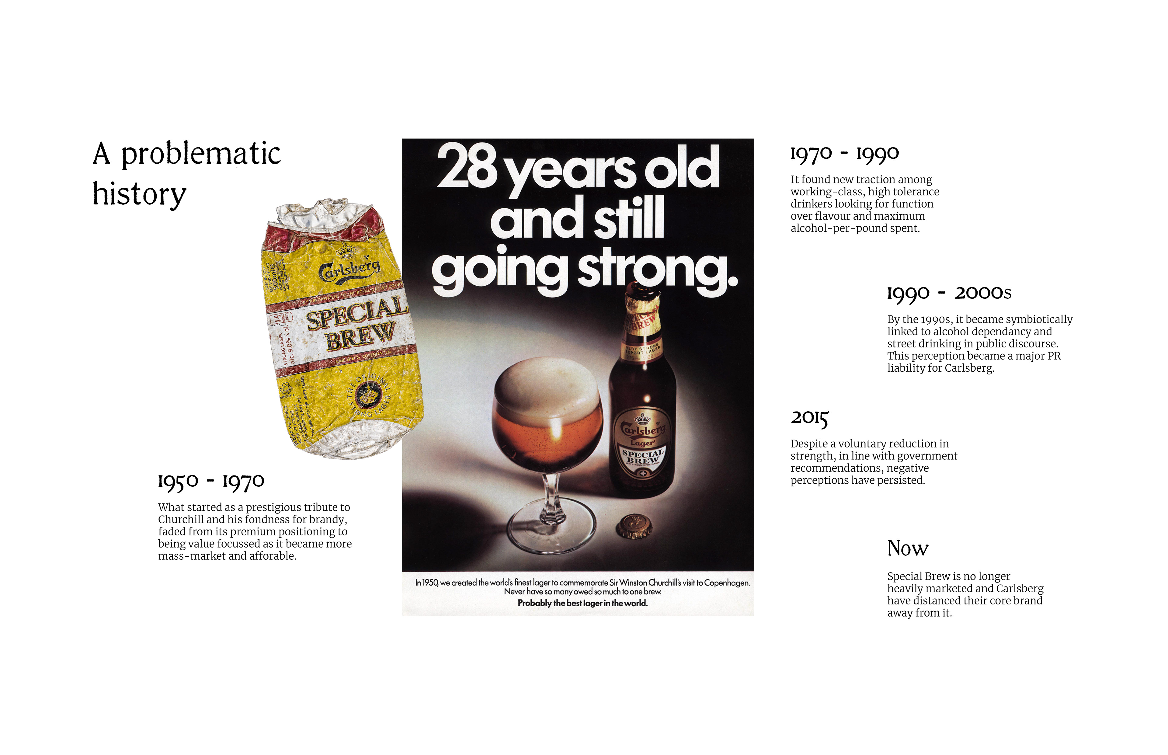
Synonymous with street drinking and alcohol dependency in the UK, this satirical rebrand explores how Special Brew’s notoriety could be reclaimed rather than sanitised. For decades, Carlsberg’s high-strength lager has been dismissed, mocked and looked down upon, yet somehow, it refuses to disappear. Repositioned as ‘too strong to die', the brand strategy recasts Special Brew as a stubborn, indomitable survivor beer—unshaken by trends and critics for over 70 years. No longer hiding in the shadows, it instead embraces its infamy and emerges defiantly as Jabberwock.
Brand Strategy | Brand Identity | Illustration | Packaging Design | Copywriting
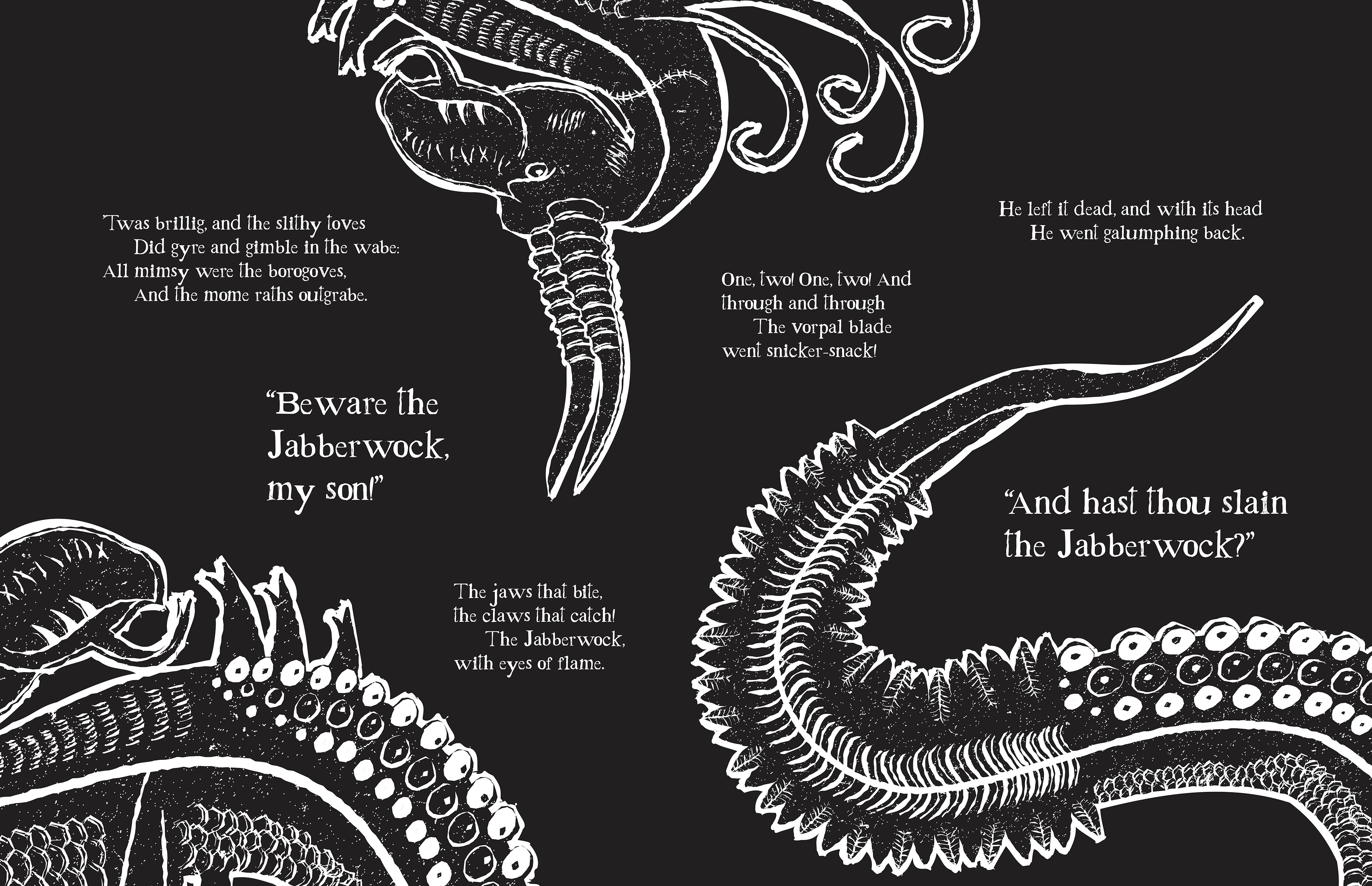
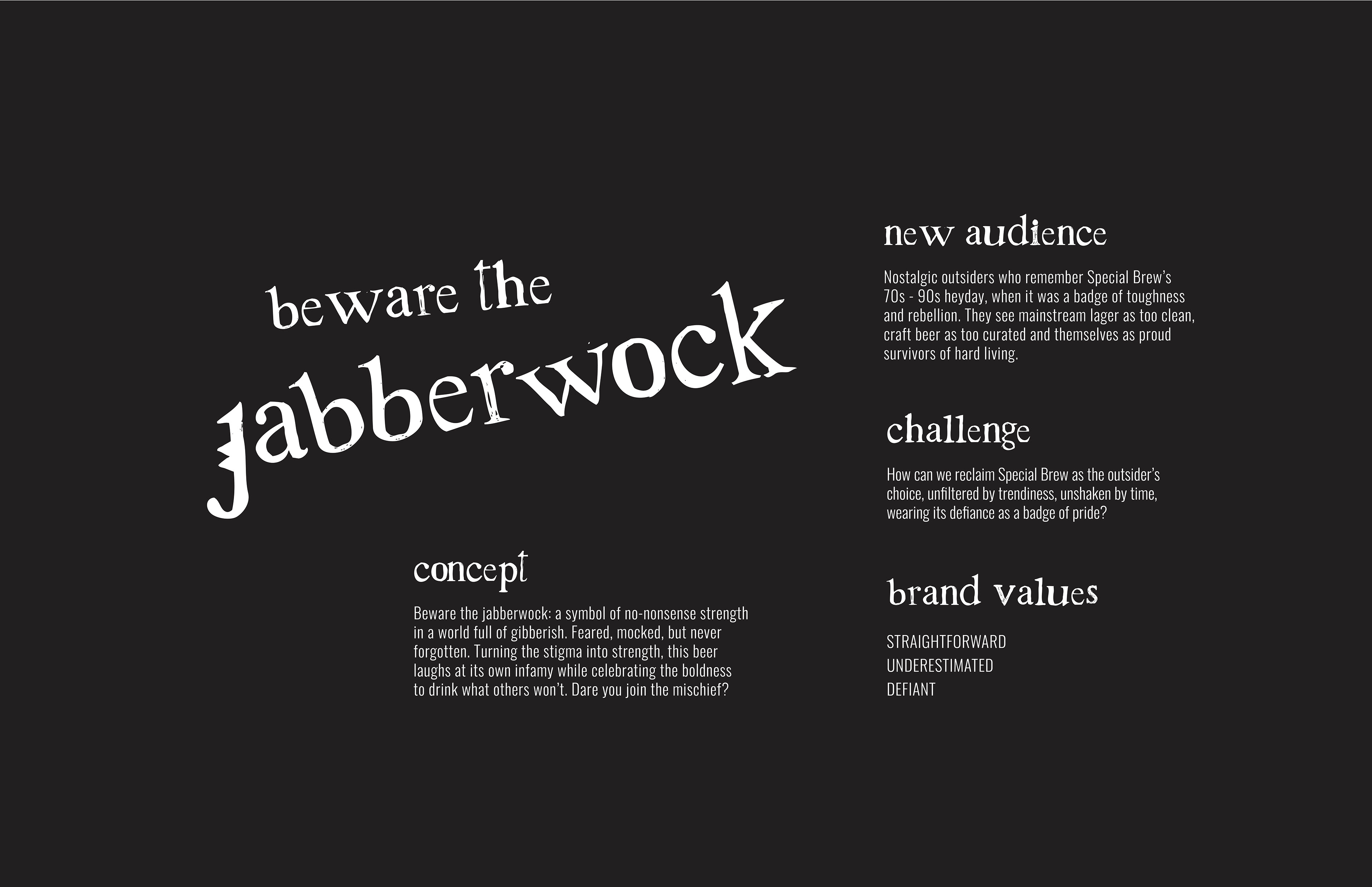
From Lewis Carroll’s classic nonsense poem, the monstrous Jabberwock is here reimagined as a symbol of no-nonsense strength, misunderstood in a world consumed by gibberish. Feared and vilified in a similar way, the source material serves as an analogy for the rebrand of Special Brew, bringing both beer and beast back from the margins to be seen anew.
Unfiltered by gimmicks or gloss, Jabberwock stands proudly apart from pretentious craft beer jargon and forgettable mainstream lager. Instead, it holds its own as a straight-up, strong lager with nothing to prove—its dark reputation now becoming a source of devilish intrigue for nostalgic drinkers and curious newcomers alike.
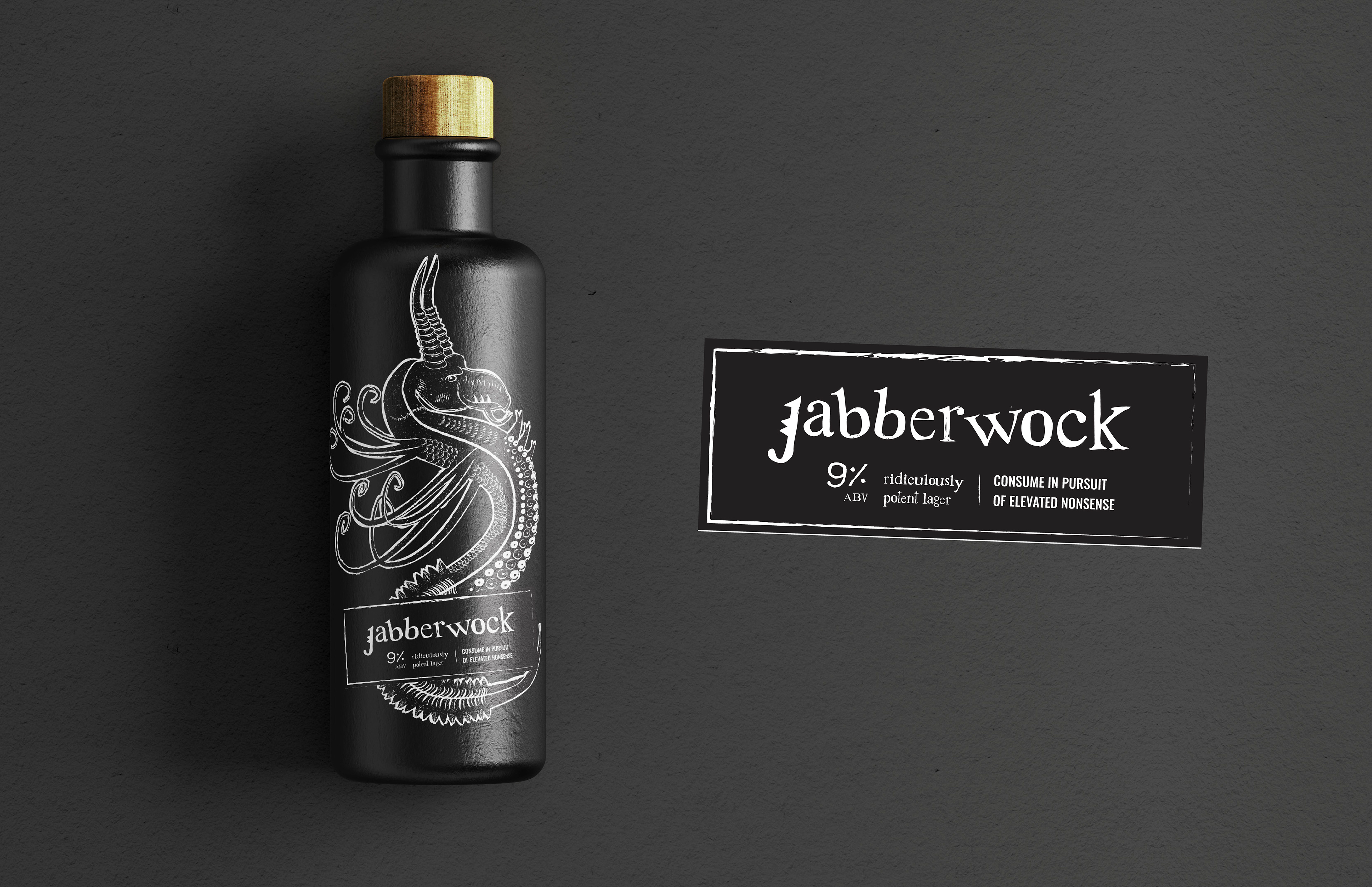
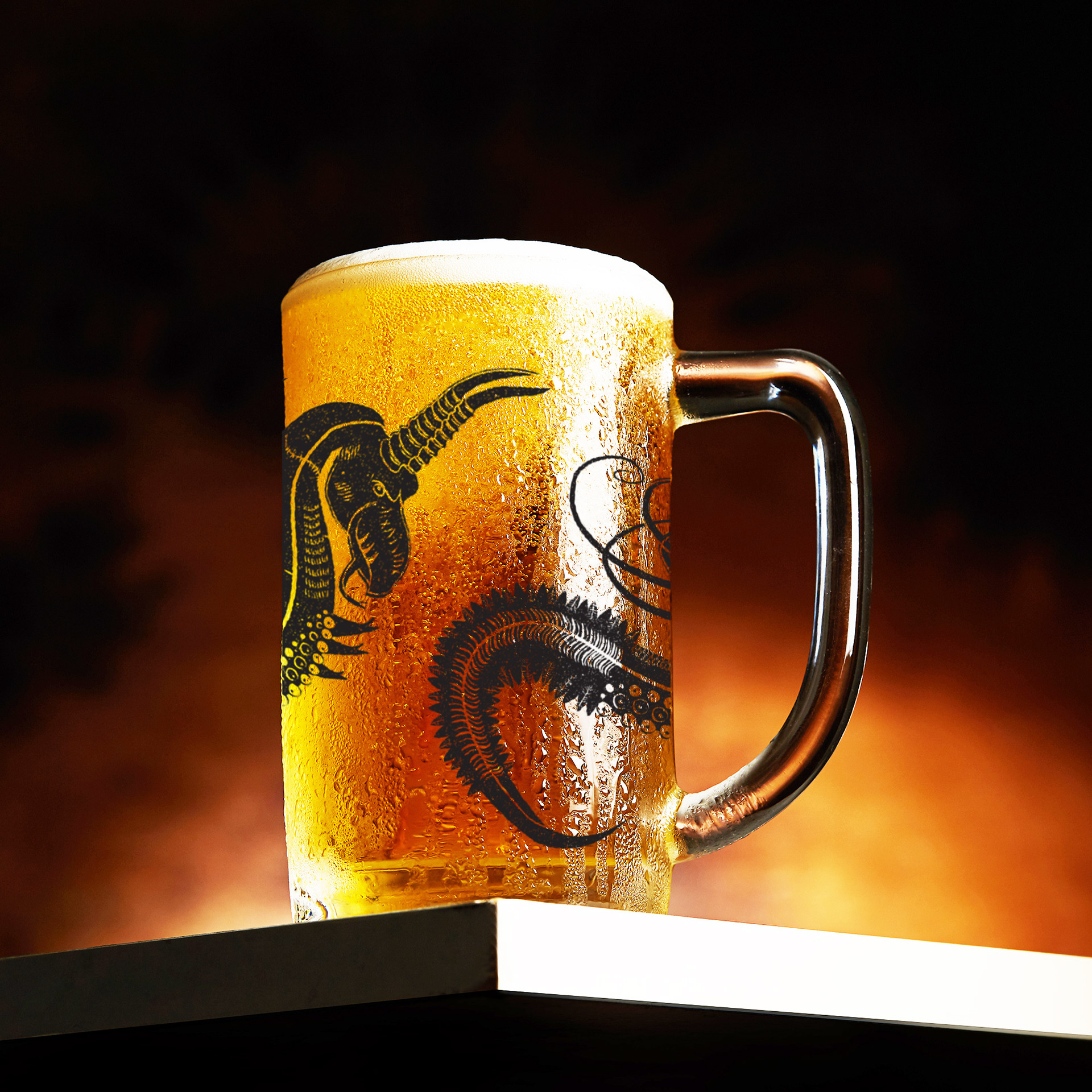
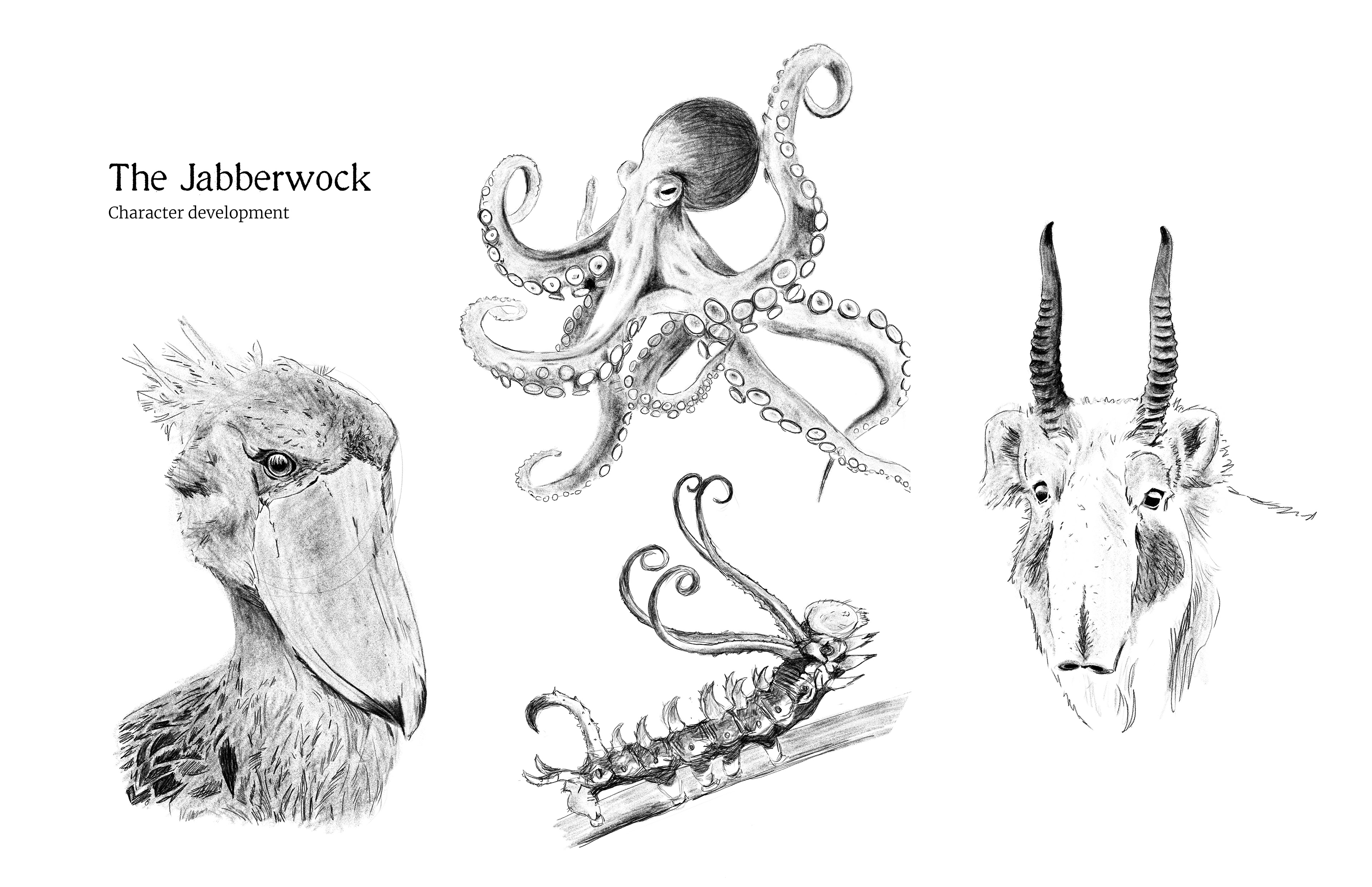
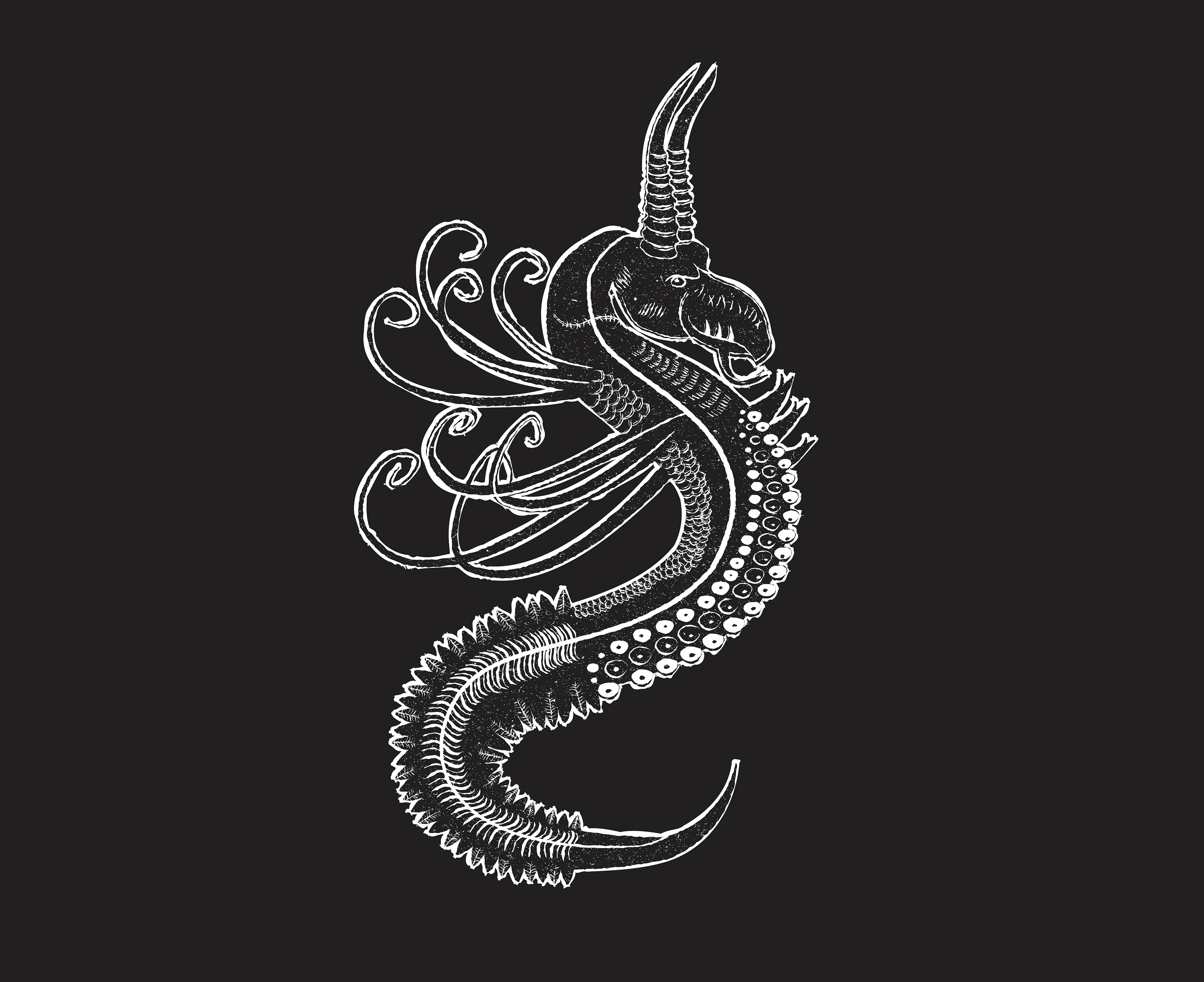
With the identity hinging so centrally on this creature, considerable attention went into the Jabberwock’s character design. Combining the poem’s descriptions with observational studies drawn from a range of unusual real-world species, the resulting illustration forms a fantastical figure that intentionally sits halfway between menace and absurdity. The stitched scar across the creature's neck subtly alludes to its resurrection, while its imperfect style echoes the look of medieval woodblock prints and manuscript marginalia, giving the brand a timeless quality reminiscent of dark folklore.
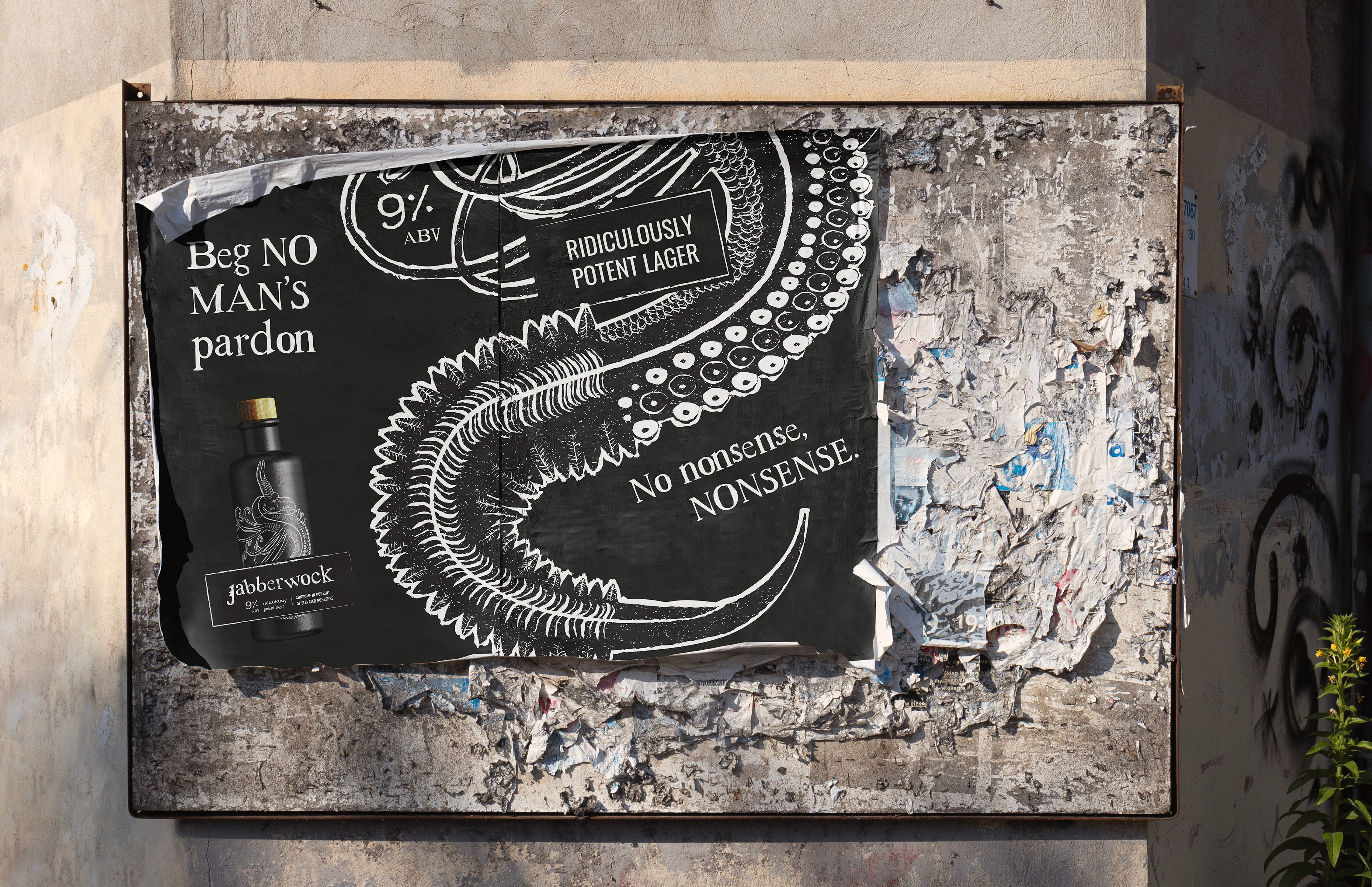
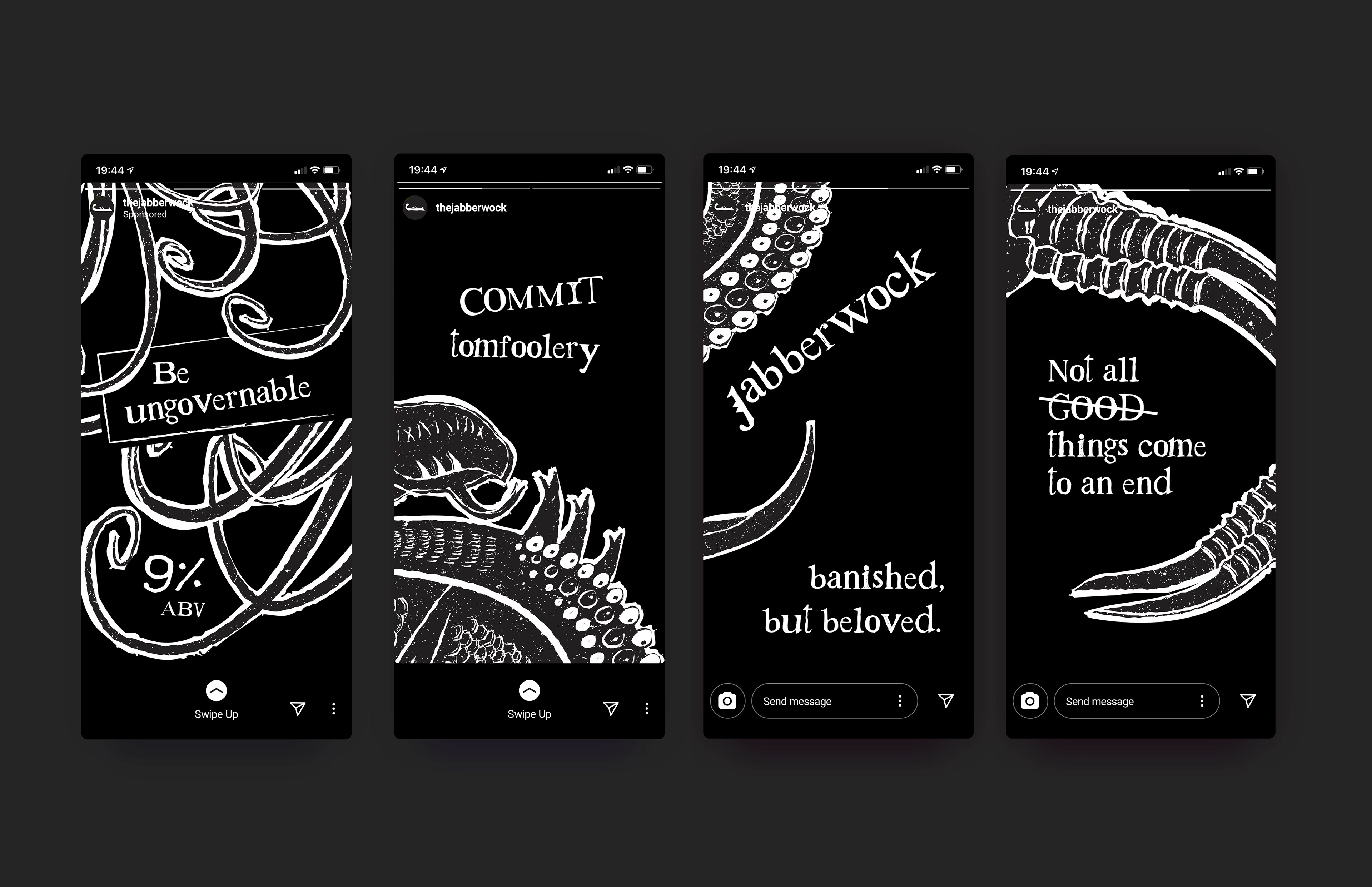
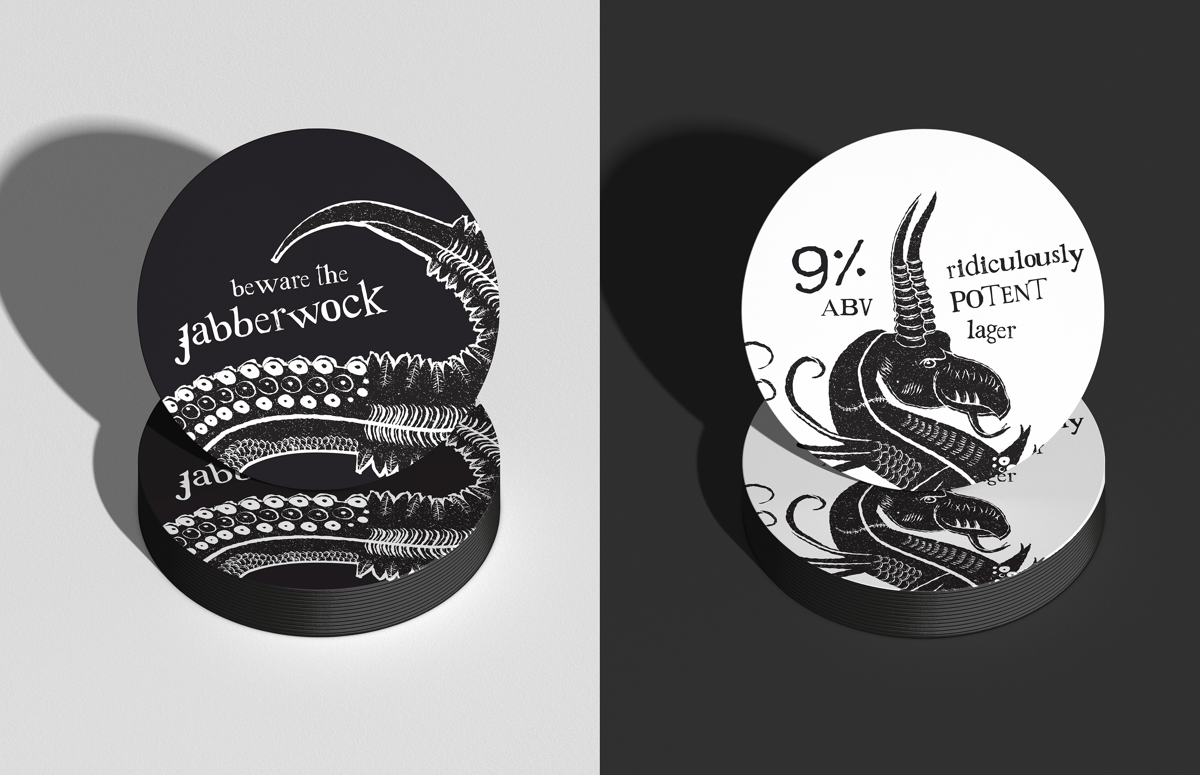
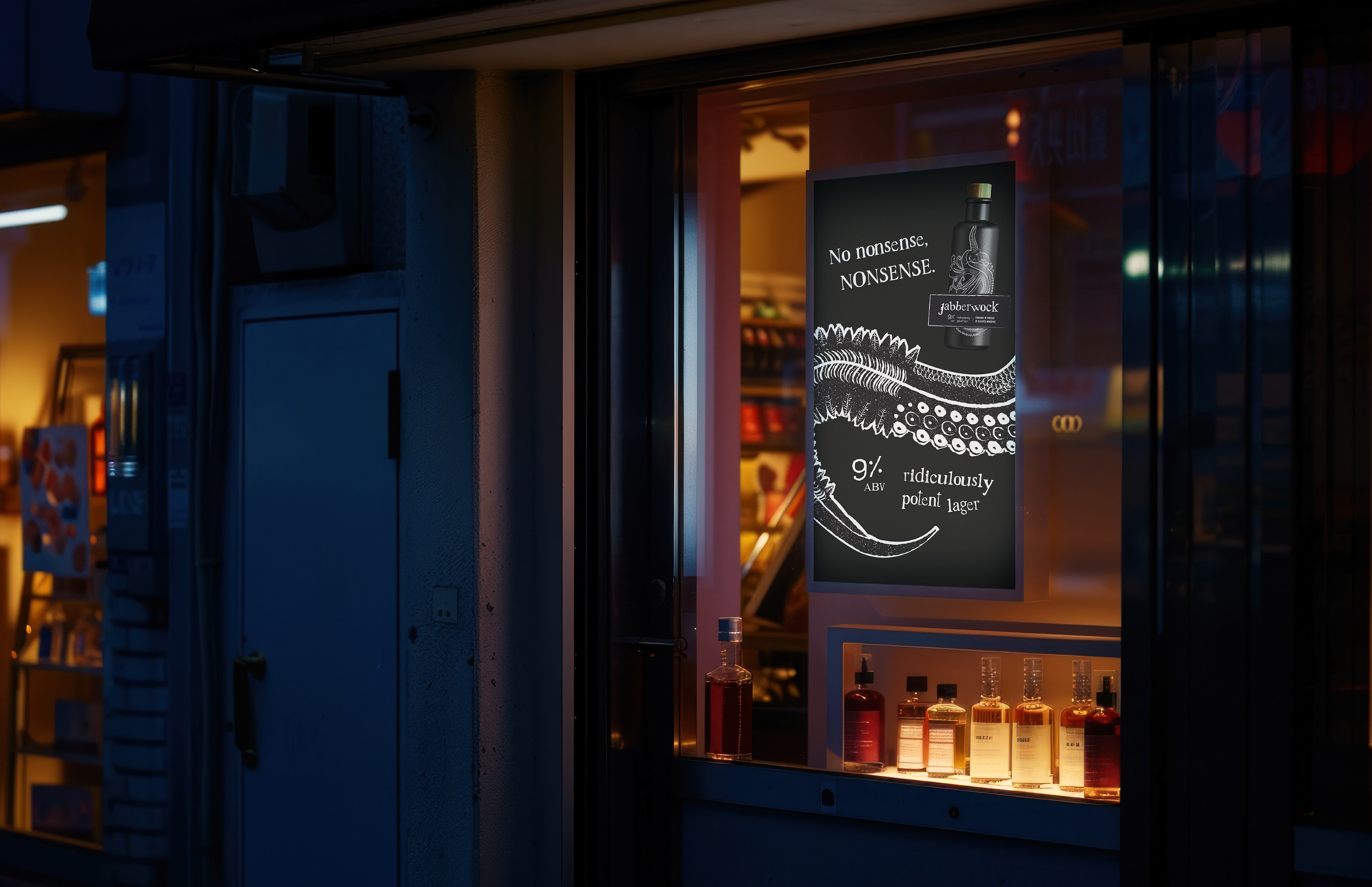
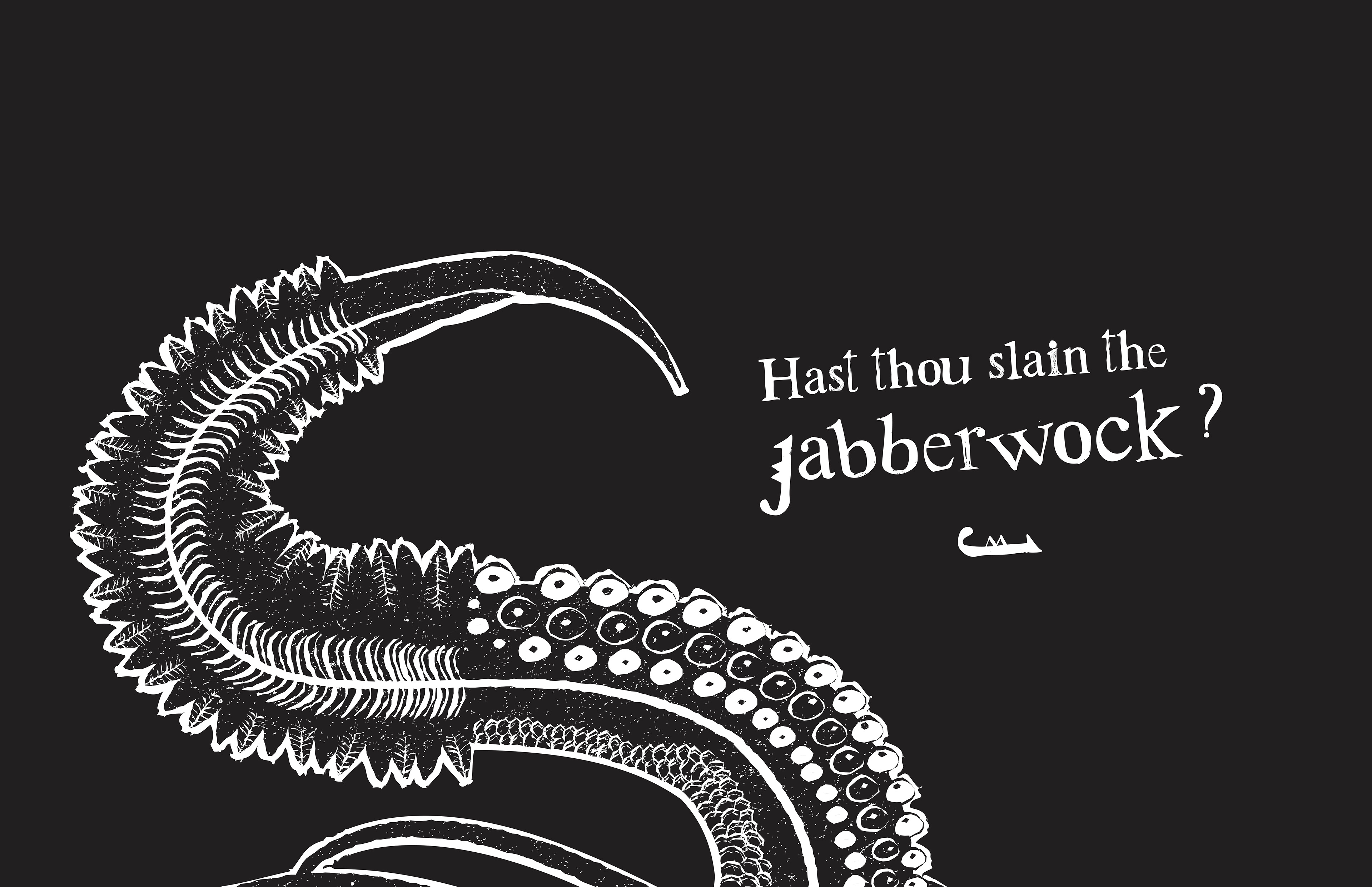
Building on this sense of myth, snippets of the beast are slowly uncovered throughout the launch campaign, heightening intrigue and anticipation before the full creature is finally revealed on primary packaging and branded glassware. Here, the Jabberwock is presented as an otherworldly curiosity—occupying the bottle like a preserved Victorian wet specimen. Borrowing from the bold claims and cautionary language of historical remedies, the vintage medicinal-inspired label complements Jabberwock’s apothecary silhouette, positioning it as a potent old-world potion ready to be rediscovered.
Taking cues from traditional spirit bottles, the packaging hints at the beer's unusually high ABV while deliberately moving away from the disposable convenience of multipack cans. By limiting the product to individual bottles, Jabberwock encourages a slower, more considered drinking experience to disrupt former rituals around its consumption. Collectively, these references transform Jabberwock’s shelf presence into an intriguing cabinet of curiosities, inviting drinkers to uncover the beast hidden within—this time with intention instead of excess.